“People count up the faults of those who keep them waiting” Seems like I kept them busy decoding this loading bar 😀
Recently, while browsing I landed on a page on StackOverflow.com where people were discussing how I implemented this loading bar on www.iogoos.com I could sense a lot of confusion in the discussion so thought I would take the mystery out as I love to share best practices. Here’s how you can create a loading bar in a few steps…
Things You’ll Need
A nice loading image: If you are good at creating animated GIF images that are nice, otherwise you can create a loading image with this cool Ajax Loading Gif Generator.
Web standards are prevailing guidelines used on the World Wide Web to ensure websites and information is accessible to all in the most efficient manner. Most Web browsers have different default settings for the base margin and padding.
This means that if you don’t set a margin and padding on your body and XHTML tags, you could get inconsistent results on the page depending upon which browser your users are using to view the page. A simple way to solve this is to set all the margin and padding on the XHTML and body tags to 0:
html, body {
    margin: 0px;
    padding: 0px;
}
This will keep your design structure in the same place on all browsers.
Borders
You may be thinking “but no browsers have a border around the body element by default”. This is not strictly true. Internet Explorer has a transparent or invisible border around elements. Unless you set the border to 0, that border will mess up your web page layouts. So add the following to your body and XHTML styles:
html, body {
    margin: 0px;
    padding: 0px;
    border: 0px;
}
Here’s a nice and detailed article on CSS Reset: Resetting Your Styles with CSS Reset Stay tuned for more web design tips.
As you already know that I’ve been working on improving the performance of my website and I needed a simple solution to create a light-box effect for Live-Chat on this website. I had many options to choose from available jQuery plug-ins however, the idea was to optimize the code with minimal use of heavy third-party scripts and CSS. Moreover, the only thing I needed was a light-box effect without any other functionality.
So I created the light-box effect with a few lines of code using CSS and jQuery.
Let’s start coding 🙂
xHTML Code
Place this code within <body></body> tags where ever you like.
<a id="show-panel" href="#">Show Panel</a>
<div id="lightbox-panel">
<h2>Lightbox Panel</h2>
You can add any valid content here.
<p align=center><a id="close-panel" href="#">Close this window</a></p>

</div>
<!-- /lightbox-panel -->
<div id="lightbox"></div>
<!-- /lightbox -->
The first line of the above code is a link with id “show-panel” which will display the “light-box” and the “lightbox-panel” DIVs, similarly, on line 7 we have a link with ID “close-panel” to hide these DIVs. This will be handled by jQuery of course.
#lightbox-panel will hold the content to be displayed and #lightbox will add a transparent background behind our content panel. Let’s write some CSS code to stylize these two DIVs before we add the functionality to our links with jQuery.
CSS Code
You can add this code within the document’s <head></head> tag or in any linked style sheet.
Note: The z-index value for #lightbox-panel should be greater than the z-index value of #lightbox to display it above the transparent background and both should have the property display as none so they should not show up by default or if the users have Javascript disabled in their browsers.
Let’s put some life to our code with jQuery.
jQuery Code
You can add this code within the document’s <head></head> tag and we are done.
Once you click the link with ID “show-panel” it will display both the DIVs with some nice fade effect and if you click the link with ID “close-panel” it will hide these DIVs.
I hope you enjoyed this little trick to create the simple light-box effect with CSS and jQuery You are most welcome to share your inputs and code in the comments below.
Good keyword research is the foundation of a successful SEO strategy. Without good keywords, all of your hard work writing SEO-friendly content, optimizing your title tags, getting rid of duplicate content and all of that fun stuff will be much less effective and, in some cases maybe even fruitless.
Keyword research is more than picking out keywords that fit your niche or offer. It requires gaining insight into patterns and searcher intent.
I encountered a great example of this very recently while looking to increase the volume of inquiries for “L1 Visas”, a type of US work visa, to a local immigration law firm. At first glance, one might think it logical to target keywords in the “L1 Visa” theme. But after doing a little research and giving it some thought, I found that this keyword is searched very infrequently and that it is very likely that the searcher making this query is researching L1Visas, and is probably not ready to seek out a lawyer for assistance.
Instead, you may want to target keyword themes that have higher search volumes and are more likely to reflect the kind of searcher intent that is going to bring you conversions. In other words, you want to get into the searcher’s way just when they are looking for what you offer, which of course is the beauty of SEO and the reason why search traffic can be so valuable.
With that in mind, it is very important to gain a complete and comprehensive understanding of your potential keywords before you do any SEO at all so that you know what trees you should be barking up. But where do you start? Here are six easy steps to keyword success:
Brainstorm: Take some time to think about all possible keywords themes that would be relevant to your business and offers. Think short-tail and don’t worry about permutations (i.e. “L1 visa” and “visa L1”), this part will come later. For now, just gather all of the root themes together into a list.
Use a keyword tool: At this point, you should engage a keyword tool to help you get more ideas and gather data. The Google Keyword Tool is ever-improving, is free, and in my opinion is pretty much all you need if used right. Plug in all of your keyword ideas – only one or a few at a time – and try to pare them down to just the relevant ones since the tool tends to include some not-so-relevant suggestions. Play with it to get to know how it works.
Build a list: Most if not all keyword tools will allow you to export your research results to Excel format. As you find more keywords, export them all to a spreadsheet. Clear out all of the less important stuff, which will usually leave you with search volume (local and global, or whatever makes sense for your campaign) and average Adwords CPC. Organize all of your keywords into themes, and sort each theme by the search volume.
Do a ranking scan: If your site is brand new, skip this part, but if you have been around for at least a few months, find out where you are ranking for all of your most relevant keywords (keep it under one or two hundred for now). Record this on your spreadsheet.
Look at your Analytics: Again, skip this part of your site is new. Here, you want to look at your Analytics to see how much traffic and/or conversions and/or revenue you are getting to each of your top keywords. Record this on your spreadsheet.
Spot opportunities: Now you have a complete and comprehensive keyword data set with which you can make informed choices and decisions. This document should give you directions. Look for your best opportunities. An example of an ideal keyword is one where you are ranked somewhere on the second page and where you are already getting a fairly significant volume of traffic/conversions/revenue. This keyword is a sitting duck – you know that getting your site onto the first page for this keyword is going to make you more money.
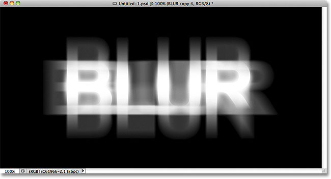
Its pretty easy to make some blurry text with CSS. We can do it by just making the text color transparent and adding some text shadow. Here’s the code for the same:
Blurry Text with CSS
To do it on the normal text we can create a class and use SPAN tag to make the text blurry.
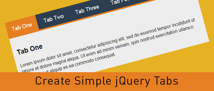
Tabbed content is a great way to handle a lot of information on a page without loosing usability and it provides a great user experience as well. Here’s a real easy way to create tabbed content with jQuery and CSS.
I’ve used the latest version of the Google-hosted jQuery library, however, you can always download the script and host it on your server.
Step 2: Write some HTML code
<div >
    <ul >
      <li data-tab="tab-1">Tab One</li>
      <li data-tab="tab-2">Tab Two</li>
      <li data-tab="tab-3">Tab Three</li>
      <li data-tab="tab-4">Tab Four</li>
    </ul>
    <div id="tab-1" >
      Lorem ipsum dolor sit amet, consectetur adipisicing elit, sed do eiusmod tempor incididunt ut labore et dolore magna aliqua. Ut enim ad minim veniam, quis nostrud exercitation ullamco laboris nisi ut aliquip ex ea commodo consequat.
    </div>
    <div id="tab-2" >
      Duis aute irure dolor in reprehenderit in voluptate velit esse cillum dolore eu fugiat nulla pariatur. Excepteur sint occaecat cupidatat non proident, sunt in culpa qui officia deserunt mollit anim id est laborum.
    </div>
    <div id="tab-3" >
      Ut enim ad minim veniam, quis nostrud exercitation ullamco laboris nisi ut aliquip ex ea commodo consequat. Duis aute irure dolor in reprehenderit in voluptate velit esse cillum dolore eu fugiat nulla pariatur.
    </div>
    <div id="tab-4" >
      Sed do eiusmod tempor incididunt ut labore et dolore magna aliqua. Ut enim ad minim veniam, quis nostrud exercitation ullamco laboris nisi ut aliquip ex ea commodo consequat.
    </div>
</div><!-- container -->
In the above code I’ve created an unordered list which will act as tabs and I’ve used a custom attribute named data-tab and set its value to tab-1, tab-2 and so forth. We will use the data-tab attribute in our jQuery script to toggle the “current” class to hide and display our tabs.
Below the unordered list, there are a few DIV elements with ID attribute same as the data-tab attribute we used in the unordered list. This will do all the magic. Before adding the magic script, lets write some CSS to stylise our HTML Unordered list and content panels.
I’ve added “current” class to the first elements and we will play with the current class to stylise the active tabs and toggle the data content div element.
I’ve used display:none for the .tab-content and display:inherit for the “current” tab. This will hide all DIV elements and show the tab with current class only. We will play with the current class to get our tabbed content work with a small magical jQuery code.
You can always change the CSS to have the look and feel similar to your website, use some image backgrounds to make it nice and smooth.
Step 4: Write the magic jQuery code
Now here’s the magic jQuery code which will actually create the tabbed content work.
When the DOM is ready, if a user clicks on any list element of ul.tabs it will grab the data-tab attribute and assign the same to tab_id variable. Then, we will remove the current class from all list elements and our DIV.tab-content elements with the jQuery removeClass attribute. Then we will add the “current” class to the clicked list element and DIV tab with the grabbed data-tab ID.
That’s it, now we have working tabbed content with jQuery and CSS. Try it, share it and let me know of your thoughts in the comments. If you need to add any additional functionality, feel free to ask in the comments.
In this tutorial, I’ll create a CSS Accordion without using any jQuery or Javascript. As I mentioned in my previous post “An easy way to create Tabbed Content with jQuery & CSS” displaying a lot of information on one page is a bit difficult and we can use tabbed content or accordions to achieve the same without compromising on user experience.
We can always use jQuery to include nice effects on our css accordion. However, we are going to create a pure css accordion that will work on any browser, with or without javascript enabled.
Lets start with writing some HTML Code. We will use UL (unordered list) element to create our pure css accordion.
HTML Code for pure CSS Accordion:
<ul id="accordion">
  <li>
    <h2>Title One</h2>
    <div >
      Lorem ipsum dolor sit amet, consectetur adipisicing elit, sed do eiusmod
      tempor incididunt ut labore et dolore magna aliqua. Ut enim ad minim veniam.
    </div>
  </li>
  <li>
    <h2>Title Two</h2>
    <div >
      Tempor incididunt ut labore et dolore magna aliqua. Ut enim ad minim veniam,
      quis nostrud exercitation ullamco laboris nisi ut aliquip ex ea commodo.
    </div>
  </li>
  <li>
    <h2>Title Three</h2>
    <div >
      Quis nostrud exercitation ullamco laboris nisi ut aliquip ex ea commodo
      consequat. Duis aute irure dolor in reprehenderit in voluptate velit esse.
    </div>
  </li>
  <li>
    <h2>Title Four</h2>
    <div >
      Consequat. Duis aute irure dolor in reprehenderit in voluptate velit esse
      cillum dolore eu fugiat nulla pariatur. Excepteur sint occaecat cupidatat non
      proident, sunt in culpa qui officia deserunt mollit anim id est laborum.
    </div>
  </li>
</ul>
As you can see, I have a UL element and added a class named “accordion”. Within the LI element, I have H2 and a DIV tag with class “content”. And we will play with the CSS display attribute to create our pure css accordion.
Lets write some CSS code to stylise the same and hide our DIV.content within the LI tags.
As you can see in above code, we have used display: none for the div.content and on li:hover we have used display:inherit . The div.content is within the list element so this trick would work. If our div.content would have been outside this panel, we would have used jQuery to achieve the same.
Very soon, I’ll explain to achieve the same with jQuery and will use some nice animation as well.
Today we will play with jQuery CSS class methods such as addClass, removeClass, hasClass, and toggleClass and learn some basic implementation to modify the HTML styles on the fly.
jQuery CSS Class Methods:
Let’s understand this is a small piece of code. First things first, You must include the jQuery library in the <head>…</head> tag.
Now our page has the jQuery library so let’s add some HTML and CSS to play with the jQuery CSS Class methods.
HTML Code:
<div id="elem">
  This is a content panel
</div>

<p>
  <a href="#" >addClass</a> /
  <a href="#" >removeClass</a> /
  <a href="#" >toggleClass</a> /
  <a href="#" >hasClass</a>
</p>
Here we have a DIV tag with ID set to element and we will use this ID to play with jQuery CSS class methods. Below that, we have a paragraph element and four links with different class names. Let’s write some CSS code and I will explain the functionality of each link when we add jQuery code.
In the CSS styles, I’ve added some styles to our DIV#elem element and also created a class named hover which will change the background, color, and border of the DIV#elem.
Now let’s add some jQuery code and learn how these jQuery CSS methods work.
$(document).ready(function(){
	// Add the class
	$('a.add-class').click(function(){
		$("#elem").addClass('hover');
		$("#elem").html('Class added ".hover"');
		return false;
	});

	// Remove the class
	$('a.remove-class').click(function(){
		$("#elem").removeClass('hover');
		$("#elem").html('Class removed ".hover"');
		return false;
	});

	// Toggle the class and check if the class has been already added or not
	$('a.toggle-class').click(function(){

		$("#elem").toggleClass('hover');

		if($("#elem").hasClass('hover')){
			$("#elem").html('Class added ".hover"');
		}else{
			$("#elem").html('Class removed ".hover"');
		}

		return false;
	});

	// Checks if the class has been already added or not
	$('a.has-class').click(function(){

		if($("#elem").hasClass('hover')){
			$("#elem").html('Class found ".hover"');
		}else{
			$("#elem").html('Class not found ".hover"');
		}

		return false;
	});

});
In the JQuery code, I’ve used the click trigger for all four links we added in the HTML code above. Also, I’ve used return false; so when we click on the link it should not redirect the user to any page or use # in the current page URL. Also, I’ve added another line of code to modify the HTML of the #elem element when we click on these links. Don’t get confused with the .html() method, this is not required, I just added it to explain the functionality.
The first link with class .add-class will add the .hover class to the #elem element. If you want to add multiple classes with one trigger you can specify different class names separated with a space as we normally do in normal HTML code. Once we click on this link, .hover class will be added to the #elem HTML element and the inner HTML will be changed and show us the result. You can click on the address link above and see it in action.
The second link with class .remove-class will remove the .hover class from the #elem element. If the element doesn’t have a .hover class, it won’t do anything so the remove class will be used only to remove any applied class.
The third link with class .toggleClass will toggle the .hove class on #elem element. If the element does not have a .hover class it will add the same otherwise vice versa. In this code, I’ve used the jQuery CSS method hasClass to check if the element has the .hover class or not. and the content of the #elem element is changed accordingly.
The fourth link will only check if the class .hover is applied to the #elem element or not and change the HTML code of the #elem element accordingly.
I hope this will clarify any doubts on using these methods, in case you have any questions or suggestions, please use the comments below to start a conversation on this topic.
Typography is the key element in the design process. While designing a web page, business card, brochure or newspaper advertisement fonts and text style plays an important role to get user attention. To design stunning elements we need fonts and fortunately, the big daddy provides a lot of them for free. We can use Google Web Fonts in our designs and they are pretty awesome and very easy to use.
How to use Google Web Fonts on a web page
It’s pretty easy to use Google Web Fonts on your website. You can do that in just three simple steps:
Choose single or multiple Google Web Font(s) from Google fonts website: //www.google.com/fonts and add them in your collection.
Hit the use link above the list of your selected fonts and Google will show you different methods to include these fonts on your website. Standard, @import or Javascript
I always use Standard method with a small trick to load the fonts before displaying the web page.
Here’s the code you would need to use Google Web Fonts on your website.
I’ve added Open Sans and Lobster fonts to my collection for this example.
<head>
<link href='//fonts.googleapis.com/css?family=Lobster|Open+Sans' rel='stylesheet' type='text/css'>
<!-- This will prefetch content from google web fonts website -->
<link rel="dns-prefetch" href="//fonts.googleapis.com" />
</head>
The above code goes within the [htmltag tag=”code”]<head>…</head>[/htmltag] tags and the DNS-prefetch link tag will fetch the contents from Google Web Fonts website. This will help resolve issues like font changes after the page load.
In the above CSS code, I’ve defined the body font as open sans and headings font as lobster. Similarly, you can use different fonts for different elements.
How to Use Google Web Fonts while Designing?
As a designer, we all need to design the mockups of the creative work before we can publish the same. If we need to use Google Web Fonts while designing layouts in Photoshop or Illustrator we will have to download the font and install the same in our Operating System.
Using Google Web Font Download Link
We can always click the Download link to save the fonts on our hard drive and then install the font on our operating system. However, what will happen if that font is updated and new characters are added or there’s a new and improved version available for that font. We need to keep a check and if the new version is available, we need to uninstall the previous version and then install the new version.
What is there’s some tool which can automatically do this task and save us a lot of time and effort?
Fortunately, there are tools available that can make our life easy and keep Google Web Fonts updated all the time.
Using Skyfonts to Download and Sync Google Fonts
Fonts.com has teamed up with Google to offer google web fonts for desktops via Skyfonts software.
We are proud to have teamed up with Google to offer desktop versions of their popular Google Fonts free of charge. Offered for use in print, these fonts are delivered using SkyFont’s patent-pending font delivery technology and can be used anywhere.
Each time a font is updated — such as when new characters are added — SkyFonts will automatically update the font on your device. Syncing Google Fonts with SkyFonts will also improve your web browsing experience, by cutting the time spent downloading fonts. ~ Fonts.com
Skyfonts software is available for both Mac and Windows. You can choose the fonts you want to use while designing and Skyfonts sync these fonts with your operating system fonts and make them available in all applications as normally installed fonts. If a new version of the installed font is available, the Skyfonts application will automatically sync and replace the older one with the new version.
Download Skyfonts Software
There are other methods available to download all Google Web Fonts on your computer, however, I found Skyfonts the easiest and most efficient to keep all the fonts updated.


