An easy way to create Tabbed Content with jQuery & CSS

Tabbed content is a great way to handle a lot of information on a page without loosing usability and it provides a great user experience as well. Here’s a real easy way to create tabbed content with jQuery and CSS.

Let’s create tabbed content with jQuery and CSS

Step 1: Include the jQuery library

<script src=//ajax.googleapis.com/ajax/libs/jquery/2.0.0/jquery.min.js></script>

I’ve used the latest version of the Google-hosted jQuery library, however, you can always download the script and host it on your server.

 Step 2: Write some HTML code

<div >
    <ul >
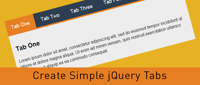
      <li data-tab="tab-1">Tab One</li>
      <li data-tab="tab-2">Tab Two</li>
      <li data-tab="tab-3">Tab Three</li>
      <li data-tab="tab-4">Tab Four</li>
    </ul>
    <div id="tab-1" >
      Lorem ipsum dolor sit amet, consectetur adipisicing elit, sed do eiusmod tempor incididunt ut labore et dolore magna aliqua. Ut enim ad minim veniam, quis nostrud exercitation ullamco laboris nisi ut aliquip ex ea commodo consequat.
    </div>
    <div id="tab-2" >
      Duis aute irure dolor in reprehenderit in voluptate velit esse cillum dolore eu fugiat nulla pariatur. Excepteur sint occaecat cupidatat non proident, sunt in culpa qui officia deserunt mollit anim id est laborum.
    </div>
    <div id="tab-3" >
      Ut enim ad minim veniam, quis nostrud exercitation ullamco laboris nisi ut aliquip ex ea commodo consequat. Duis aute irure dolor in reprehenderit in voluptate velit esse cillum dolore eu fugiat nulla pariatur.
    </div>
    <div id="tab-4" >
      Sed do eiusmod tempor incididunt ut labore et dolore magna aliqua. Ut enim ad minim veniam, quis nostrud exercitation ullamco laboris nisi ut aliquip ex ea commodo consequat.
    </div>
</div><!-- container -->

In the above code I’ve created an unordered list which will act as tabs and I’ve used a custom attribute named data-tab and set its value to tab-1, tab-2 and so forth. We will use the data-tab attribute in our jQuery script to toggle the “current” class to hide and display our tabs.

Below the unordered list, there are a few DIV elements with ID attribute same as the data-tab attribute we used in the unordered list. This will do all the magic. Before adding the magic script, lets write some CSS to stylise our HTML Unordered list and content panels.

I’ve added “current” class to the first elements and we will play with the current class to stylise the active tabs and toggle the data content div element.

Step 3: Write some CSS to style the HTML

body{
	margin-top: 100px;
	font-family: 'Trebuchet MS', serif;
	line-height: 1.6
}
.container{
	width: 800px;
	margin: 0 auto;
}

ul.tabs{
	margin: 0px;
	padding: 0px;
	list-style: none;
}
ul.tabs li{
	background: none;
	color: #222;
	display: inline-block;
	padding: 10px 15px;
	cursor: pointer;
}

ul.tabs li.current{
	background: #ededed;
	color: #222;
}

.tab-content{
	display: none;
	background: #ededed;
	padding: 15px;
}

.tab-content.current{
	display: inherit;
}

I’ve used display:none for the .tab-content and display:inherit for the “current” tab. This will hide all DIV elements and show the tab with current class only. We will play with the current class to get our tabbed content work with a small magical jQuery code.

You can always change the CSS to have the look and feel similar to your website, use some image backgrounds to make it nice and smooth.

Step 4: Write the magic jQuery code

Now here’s the magic jQuery code which will actually create the tabbed content work.

$(document).ready(function(){
	$('ul.tabs li').click(function(){
		var tab_id = $(this).attr('data-tab');
		$('ul.tabs li').removeClass('current');
		$('.tab-content').removeClass('current');
		$(this).addClass('current');
		$("#"+tab_id).addClass('current');
	});
});

When the DOM is ready, if a user clicks on any list element of ul.tabs it will grab the data-tab attribute and assign the same to tab_id variable. Then, we will remove the current class from all list elements and our DIV.tab-content elements with the jQuery removeClass attribute. Then we will add the “current” class to the clicked list element and DIV tab with the grabbed data-tab ID.

That’s it, now we have working tabbed content with jQuery and CSS. Try it, share it and let me know of your thoughts in the comments. If you need to add any additional functionality, feel free to ask in the comments.

contact us

How to Create Pure CSS Accordion

In this tutorial, I’ll create a CSS Accordion without using any jQuery or Javascript. As I mentioned in my previous post “An easy way to create Tabbed Content with jQuery & CSS” displaying a lot of information on one page is a bit difficult and we can use tabbed content or accordions to achieve the same without compromising on user experience.

We can always use jQuery to include nice effects on our css accordion. However, we are going to create a pure css accordion that will work on any browser, with or without javascript enabled.

Lets start with writing some HTML Code. We will use UL (unordered list) element to create our pure css accordion.

HTML Code for pure CSS Accordion:

<ul id="accordion">
  <li>
    <h2>Title One</h2>
    <div >
      Lorem ipsum dolor sit amet, consectetur adipisicing elit, sed do eiusmod
      tempor incididunt ut labore et dolore magna aliqua. Ut enim ad minim veniam.
    </div>
  </li>
  <li>
    <h2>Title Two</h2>
    <div >
      Tempor incididunt ut labore et dolore magna aliqua. Ut enim ad minim veniam,
      quis nostrud exercitation ullamco laboris nisi ut aliquip ex ea commodo.
    </div>
  </li>
  <li>
    <h2>Title Three</h2>
    <div >
      Quis nostrud exercitation ullamco laboris nisi ut aliquip ex ea commodo
      consequat. Duis aute irure dolor in reprehenderit in voluptate velit esse.
    </div>
  </li>
  <li>
    <h2>Title Four</h2>
    <div >
      Consequat. Duis aute irure dolor in reprehenderit in voluptate velit esse
      cillum dolore eu fugiat nulla pariatur. Excepteur sint occaecat cupidatat non
      proident, sunt in culpa qui officia deserunt mollit anim id est laborum.
    </div>
  </li>
</ul>

As you can see, I have a UL element and added a class named “accordion”. Within the LI element, I have H2 and a DIV tag with class “content”. And we will play with the CSS display attribute to create our pure css accordion.

Lets write some CSS code to stylise the same and hide our DIV.content within the LI tags.

CSS Code for pure CSS Accordion:

#accordion{
    width: 600px;
    margin: 0px;
    padding: 0px;
    list-style: none;
}
#accordion h2{
    font-size: 12pt;
    margin: 0px;
    padding: 10px;
    background: #ccc;
    border-bottom: 1px solid #fff;
}
#accordion li div.content{
    display: none;
    padding: 10px;
    background: #f9f9f9;
    border: 1px solid #ddd;
}
#accordion li:hover div.content{
    display: inherit;
}

As you can see in above code, we have used display: none for the div.content and on li:hover we have used display:inherit . The div.content is within the list element so this trick would work. If our div.content would have been outside this panel, we would have used jQuery to achieve the same.

Very soon, I’ll explain to achieve the same with jQuery and will use some nice animation as well.

contact us

Best Website Designing Services

CSS3 Animation – Stylish Links and other HTML elements

Links, Links, Links!! That’s what we have all over the internet. On our website and blog posts, we have a lot of links to point a user to another page. Today I will share a small trick to stylize the links with CSS3 Animation. That’s what I’ve used on this website and you can apply the same as well to change the link color with style on hover.

CSS3 Animation

With CSS3 animation, we can add some effects when changing from one style to another without using any flash or javascript. We will use CSS animation transition to add some cool effects to the anchor tags.

How it works

CSS3 transition effects let an element gradually change from one style to another. To do this we must specify two things:

Specify the CSS property we want to add an effect too.
Specify the duration of the effect.
Optionally we can specify “transition-timing-function” which is set to “ease” by default however, we can use any of these.

 linear|ease|ease-in|ease-out|ease-in-out

Now let us play with CSS3 Animation transition

HTML Code

<a href="#" title="" > CSS3 Animation - Color </a>
<a href="#" title="" > CSS3 Animation - Background Color </a>
<div > Change Width </div>

CSS Code

.color-animation{
	color: blue;
	-webkit-transition: color 1s ease;
	-moz-transition: color 1s ease;
	-o-transition: color 1s ease;
	-ms-transition: color 1s ease;
	transition: color 1s ease;
}
.color-animation:hover{
	color: red;
	-webkit-transition: color 1s ease;
	-moz-transition: color 1s ease;
	-o-transition: color 1s ease;
	-ms-transition: color 1s ease;
	transition: color 1s ease;
}
.background-animation{
	background: blue !important;
	color: white !important;
	-webkit-transition: background 1s ease;
	-moz-transition: background 1s ease;
	-o-transition: background 1s ease;
	-ms-transition: background 1s ease;
	transition: background 1s ease;
}
.background-animation:hover{
	background: red !important;
	color: white !important;
	-webkit-transition: background 1s ease;
	-moz-transition: background 1s ease;
	-o-transition: background 1s ease;
	-ms-transition: background 1s ease;
	transition: background 1s ease;
}
.change-width{
	width: 150px;
	background: #444;
	color: #fff;
	margin: 20px auto;
	padding: 10px;
	-webkit-transition: width 1s ease;
	-moz-transition: width 1s ease;
	-o-transition: width 1s ease;
	-ms-transition: width 1s ease;
	transition: width 1s ease;
}
.change-width:hover{
	width: 350px;
	-webkit-transition: width 1s ease;
	-moz-transition: width 1s ease;
	-o-transition: width 1s ease;
	-ms-transition: width 1s ease;
	transition: width 1s ease;
}

Try this code on a blank HTML page and add the CSS either within ... tags or in your stylesheet. Play around a bit with the CSS to understand the CSS3 Animation transition and create some cool effects for your website links and other block-level elements. Feel free to discuss this further in the comments. You can also contact IOGOOS Solution to build Website Animation Services.

WordPress Developer

Website Development Services

Google Web Fonts – How to Use, Download, and Sync

Typography is the key element in the design process. While designing a web page, business card, brochure or newspaper advertisement fonts and text style plays an important role to get user attention. To design stunning elements we need fonts and fortunately, the big daddy provides a lot of them for free. We can use Google Web Fonts in our designs and they are pretty awesome and very easy to use.

How to use Google Web Fonts on a web page

It’s pretty easy to use Google Web Fonts on your website. You can do that in just three simple steps:

  1. Choose single or multiple Google Web Font(s) from Google fonts website: //www.google.com/fonts and add them in your collection.
  2. Hit the use link above the list of your selected fonts and Google will show you different methods to include these fonts on your website. Standard, @import or Javascript
  3. I always use Standard method with a small trick to load the fonts before displaying the web page.

Here’s the code you would need to use Google Web Fonts on your website.

I’ve added Open Sans and Lobster fonts to my collection for this example.

<head>
<link href='//fonts.googleapis.com/css?family=Lobster|Open+Sans' rel='stylesheet' type='text/css'>
<!-- This will prefetch content from google web fonts website -->
<link rel="dns-prefetch" href="//fonts.googleapis.com" />
</head>

The above code goes within the [htmltag tag=”code”]<head>…</head>[/htmltag] tags and the DNS-prefetch link tag will fetch the contents from Google Web Fonts website. This will help resolve issues like font changes after the page load.

body{
    font-family: 'Open Sans', sans-serif;
}
h1, h2, h3, h4, h5, h6{
    font-family: 'Lobster', cursive;
}

In the above CSS code, I’ve defined the body font as open sans and headings font as lobster. Similarly, you can use different fonts for different elements.

How to Use Google Web Fonts while Designing?

As a designer, we all need to design the mockups of the creative work before we can publish the same. If we need to use Google Web Fonts while designing layouts in Photoshop or Illustrator we will have to download the font and install the same in our Operating System.

We can always click the Download link to save the fonts on our hard drive and then install the font on our operating system. However, what will happen if that font is updated and new characters are added or there’s a new and improved version available for that font. We need to keep a check and if the new version is available, we need to uninstall the previous version and then install the new version.

What is there’s some tool which can automatically do this task and save us a lot of time and effort?

Fortunately, there are tools available that can make our life easy and keep Google Web Fonts updated all the time.

Using Skyfonts to Download and Sync Google Fonts

Fonts.com has teamed up with Google to offer google web fonts for desktops via Skyfonts software.

We are proud to have teamed up with Google to offer desktop versions of their popular Google Fonts free of charge. Offered for use in print, these fonts are delivered using SkyFont’s patent-pending font delivery technology and can be used anywhere.

Each time a font is updated — such as when new characters are added — SkyFonts will automatically update the font on your device. Syncing Google Fonts with SkyFonts will also improve your web browsing experience, by cutting the time spent downloading fonts. ~ Fonts.com

Skyfonts software is available for both Mac and Windows. You can choose the fonts you want to use while designing and Skyfonts sync these fonts with your operating system fonts and make them available in all applications as normally installed fonts. If a new version of the installed font is available, the Skyfonts application will automatically sync and replace the older one with the new version.

Download Skyfonts Software

There are other methods available to download all Google Web Fonts on your computer, however, I found Skyfonts the easiest and most efficient to keep all the fonts updated.

Signup.

Add Custom Post Types to Main WordPress RSS Feed

Custom post types are a great feature introduced in WordPress 3.0 and it extended the functionality and practical usage of this awesome CMS. While re-designing / re-structuring iogoos.com, I have used Custom Post Types for different sections on this website.

Now I want to add all these custom post types to the main WordPress feed so the users get updated content from each section via RSS. There are two ways we can do that. You can add the below code snippets to the functions.php file of your theme.

1. Add all Custom Post Types to Main WordPress RSS Feed

function extend_feed($qv) {
	if (isset($qv['feed']))
		$qv['post_type'] = get_post_types();
	return $qv;
}
add_filter('request', 'extend_feed');

Function get_post_types() will return all registered custom post types. Here you can learn more about get_post_types() function.

2. Add selected Custom Post Types to Main WordPress RSS Feed

I’ve used the woo-commerce plugin for the shop section of this website and this plugin added a few more custom post types that may be not relevant or useful for my readers. So with the code snippet below, we can add a few selected Custom Post Types to the main WordPress RSS Feed.

function extend_feed($qv) {
	if (isset($qv['feed']) && !isset($qv['post_type']))
		$qv['post_type'] = array('post', 'tutorials', 'tips', 'snippets', 'shop');
	return $qv;
}
add_filter('request', 'extend_feed');

If you notice, here instead of using the get_post_types() function, I supplied an array of specific custom post types slugs. This will add content to WordPress’s main RSS feed only from the specified post types.

Contact Us
iogoos.com

previous article

How to create a category-based search box with CSS and jQuery

There are a few times when we want our website visitors to search content in just one category and not the whole website. Today I am sharing a simple but effective UI trick to create a category-based search box with CSS and jQuery.

HTML

<div >
  <input type=text value="" placeholder="search:" />
  <div >
   <label><input type=radio name=filter value="value" /> Category One</label>
   <label><input type=radio name=filter value="value" /> Category Two</label>
   <label><input type=radio name=filter value="value" /> Category Three</label>
   <label><input type=radio name=filter value="value" /> Category Four</label>
   <label><input type=radio name=filter value="value" /> Category Five</label>
   <label><input type=radio name=filter value="value" /> Category Six</label>
  </div>
</div>

Now let’s just add some styles to out HTML code above.

CSS

#demo {
  width: 600px;
  margin: 100px auto 0 auto;
}
#demo .search-box {
  width: 100%;
  position: relative;
}
#demo .search-box input[type="text"] {
  width: 100%;
  padding: 10px;
  background: #fff;
  border: 1px solid #ddd;
  font-size: 12pt;
  margin: 0px;
}
#demo .search-box input[type="text"]:focus {
  box-shadow: none !important;
  outline: none !important;
}
#demo .search-box .search-filters {
  display: none;
  width: 100%;
  background: #fff;
  padding: 10px;
  border: 1px solid #ddd;
  border-top: 0px;
}
#demo .search-box .search-filters:after {
  content: "";
  display: table;
}
#demo .search-box .search-filters label {
  margin-bottom: 7px;
  font-size: 13px;
  display: inline-block;
  width: 50%;
  float: left;
}

You can use the above CSS or create your own styles by changing the backgrounds, colors etc.

Now let’s add the jQuery magic and make this piece of code look great

jQuery

Make sure you call the jQuery script on the page by adding this code on the page.

<img src=data:image/gif;base64,R0lGODlhAQABAIAAAAAAAP///yH5BAEAAAAALAAAAAABAAEAAAIBRAA7 data-wp-preserve="%3Cscript%20src%3D%22http%3A%2F%2Fcode.jquery.com%2Fjquery-1.11.0.min.js%22%3E%3C%2Fscript%3E" data-mce-resize="false" data-mce-placeholder="1" width=20 height=20 alt="<script>" title="<script>" />
<img src=data:image/gif;base64,R0lGODlhAQABAIAAAAAAAP///yH5BAEAAAAALAAAAAABAAEAAAIBRAA7 data-wp-preserve="%3Cscript%20src%3D%22http%3A%2F%2Fcode.jquery.com%2Fjquery-migrate-1.2.1.min.js%22%3E%3C%2Fscript%3E" data-mce-resize="false" data-mce-placeholder="1" width=20 height=20 alt="<script>" title="<script>" /><span id="mce_marker" data-mce-type="bookmark" data-mce-fragment="1">​</span>
jQuery(document).ready(function($){
  $('.search-box input[type="text"]').focus(function(){
    $('.search-filters').slideToggle();
  });
  $('.search-filters input[type="radio"]').on('click', function(){
    var placeholder_text = $(this).closest('label').text();
    $('.search-input').attr('placeholder', 'search: '+placeholder_text);
    $('.search-filters').slideToggle();
  });
});<span id="mce_marker" data-mce-type="bookmark" data-mce-fragment="1">​</span>
contact us

Like this code.

Our Services

How-To: Copy current directory path in Terminal

While working on multiple projects I always need to copy the current path of a directory in Terminal. I used to use the command pwd in the terminal that prints the current directory path in the terminal and then I have to select the path with the mouse to copy and paste the same where I needed.

I hate to use the mouse as it wastes a lot of time and to save time and copy the current path without selecting it with the mouse, I found this command and use it all the time.

pwd | pbcopy

This command will copy the current directory path to the clipboard and we can then press CMD+V (CTRL+V for Windows) to paste the path wherever needed.

I hope this will help someone save time and be more productive.+

img

Our Services

How-to: Get Current Url in PHP with or without Query String

In each PHP website, we need to find out the current URL of the page, and here’s the PHP code to find out the current URL of the page a user is browsing with or without the query string.

function currentUrl( $trim_query_string = false ) {
    $pageURL = (isset( $_SERVER['HTTPS'] ) && $_SERVER['HTTPS'] == 'on') ? "//" : "//";
    $pageURL .= $_SERVER["SERVER_NAME"] . $_SERVER["REQUEST_URI"];
    if( ! $trim_query_string ) {
        return $pageURL;
    } else {
        $url = explode( '?', $pageURL );
        return $url[0];
    }
}

I like to keep such functions in a helpers class so I can use them anywhere in the app. To use it in a PHP class you can use the following code:

public function currentUrl( $trim_query_string = false ) {
    $pageURL = (isset( $_SERVER['HTTPS'] ) && $_SERVER['HTTPS'] == 'on') ? "//" : "//";
    $pageURL .= $_SERVER["SERVER_NAME"] . $_SERVER["REQUEST_URI"];
    if( ! $trim_query_string ) {
        return $pageURL;
    } else {
        $url = explode( '?', $pageURL );
        return $url[0];
    }
}
Contact Us

Our Services

How-To: Create Easy Element Toggles with Data Attributes and jQuery.

While working on my latest WordPress plugin, I found myself using jQuery toggleClass on multiple elements and writing JS code for each was not at all a better solution. To fix this issue and keep the code clean and short I used the following code.

$(document).on('click', '[data-toggle="class"]', function () {
    var $target = $($(this).data('target'));
    var classes = $(this).data('classes');
    $target.toggleClass(classes);
    return false;
});

Make sure you have jQuery script on your page and add this code to your Javascript file and then you can use it in your HTML code as below:

<a href="#" data-toggle="class" data-target="#element" data-classes="is-active">Click here</a> to toggle.
<div id="element">...content goes here...</div>

The anchor tag with data-toggle will look for an element with ID or element and toggle is-active class for that element. You can apply this logic to any UI element such as Modal with an overlay background and use the data-toggle attributes on the modal background as well to hide the modal.

Feel free to implement and extend this code on your projects.

contact us

Our services

Avail Benefits of Local SEO for Small Business by Local SEO tips

In an online world, every user executes searches locally with their mobile phones before a visit to the business area. 50% of users are local intent. It’s time to give priority to local organic search. Get insight into Local Search Engine Optimization (SEO). Local SEO for small business gives a facelift to online eyeshot in SERP.

Local SEO for small business is all about specific business location component like:

  • barber near me
  • plumber near me
  • Coffee shop near me

Organic and Local SEO is different. Organic SEO has major components like On-site optimization, Technical SEO, and link building. But for Local SEO for small business, all you need to work on Google free tools i.e., Google My Business (GMB) that attract local search. Local SEO leads to people come to your store or business place. Brick and mortar store is facing challenges in comparison to online shopping.

To make position on Top Local search itself, Google work on certain points like:

  • Social presence signals
  • Reviews
  • Citation
  • Link Signal

search ranking factors

An additional plus point of Local SEO is:

  • Search engine ranking and enhancement in sales.
  • Build-in brand image.
  • Passive customer interaction.
  • Bring you closer to your customers.

Now the question is who has to influence Local SEO?

The simple answer is Company or local store or small business with a physical location. Examples:

  • Bars, Restaurants, & Caterers
  • Skilled trades (plumbers, electricians, carpenters, etc.)
  • Daycare centers
  • Real estate firms
  • Auto dealerships
  • Hospitals
  • Stationary food trucks
  • Kiosks & ATMs
  • Gas stations

Businesses that have not local can go to an online store.

I think the basic of Local Search Engine Optimization has been cleared. Now, it’s time to make a Plan of action that would be of great assistance in making rank locally for small business

local seo example

1. Claim and verify your Google My Business listing

In simple terms, Google My Business is the foundation of SEO strategy. Let us start with claiming business at GMB. This step is on high priority because the 35% to 40% ranking signal comes from GMB. Few highlights of GMB that reflect your business:

  • Local Search Visibility
  • Online consistency
  • First impression and first sight
  • Helps in SEO
  • Easy to use
  • Easily showcase your business hours, products, and more.

A business owner can manage business very efficiently.

=>> Steps to create GMB profile:

I. Visit https://www.google.com/business/.

II.  Enter your business name.

III. Choose a category that fits your business.

IV. Register your business’s location.

V. Add your business details like phone number and website.

And it’s that easy.

Once the GMB account is verified, the listing will appear on maps.

Google My Business

2. Add your business on citation or directories

Citations are just a process to add a business on various business listing sites. There are many well-renowned citations are:

  • Foursquare
  • Trip Advisor
  • Bing
  • Yellow Pages
  • Facebook

Submitting your business on various citations shows the popularity of the business.

3. NAP (Name, Address, and Phone) Details

Name, address, and phone number are the business details that will be filled in every directory. Fallacious details lead to loss.

4. Stimulate end-user to list a review

Most of the customer rely on review because this is personal suggestion or words. Optimistic feedback make freedom from suspicion and becomes more ethical. And ultimately navigate to expand traffic and sale. There are some free tools through which you can gather feedback from customers like Yelp, Facebook, and more. Google My Business has an inbuilt feature that anyone can submit their review.

Ask or suggest your near customer mention their actual opinion about the service through SMS, E-Mail or website. Be active to say in response to feedback. This goes well with customer self-gratification. If anyone posted a negative review, make them positive by clarifying.

list review

Last but not least

5. How to optimize Local SEO for small business in the right way?

In respect of Local SEO for small business, the best approach is to consider existing SEO practices. It means that the URL must be short, gripping meta title and description, longtail optimized keyword plan, and many more. Add photos and content repeatedly. Highlight your company by adding service.

Add content like FAQ section, Discounts, special offers. Use of H1 and focused keywords within the first 100 words of your content.

contact us

Overall to conclude, SEO is evolving rapidly. Keep eye on updated SEO trends and strategies. Come out of myths related Cheap SEO Services are not good. You need to know the authentic facts. Put your investment in youthful companies that work actually for your business. Cheap or Affordable SEO Services provide service at a cost-effective rate that every business owner can afford. Make ready your business to show online. Contact us online or call us at (+91) 9540007839, (+1)315 215 0919.

Explore more about:

>> How Affordable SEO Services helps in the business expansion?

>> Choose WordPress Development Services Company from the list.

Enquiry Now

When We Work Together

We can create something incredible

arrow
HQ INDIA
HQ INDIA
C-31, Milap Nagar,
Uttam Nagar, New Delhi,
Delhi 110059
USA
USA
6715 Backlick Rd Suite 202
Springfield,
VA 22150, USA
AUSTRALIA
AUSTRALIA
2/51, Lane Cres,
Reservoir, VIC
3037, Australia
CANADA
CANADA
61 Payzant Bog Road, Falmouth, NS, B0P 1P0, CANADA
UK
UK
3rd Floor, 131 City Road, London, EC1V 2NX, United Kingdom
UAE
UAE
Boutik Mall, Al Reem Island - Abu Dhabi, UAE
X

Let Us Call You Back

  • India+91
  • United States+1
  • United Arab Emirates+971

Your phone number is kept confidential
and not shared with others.